
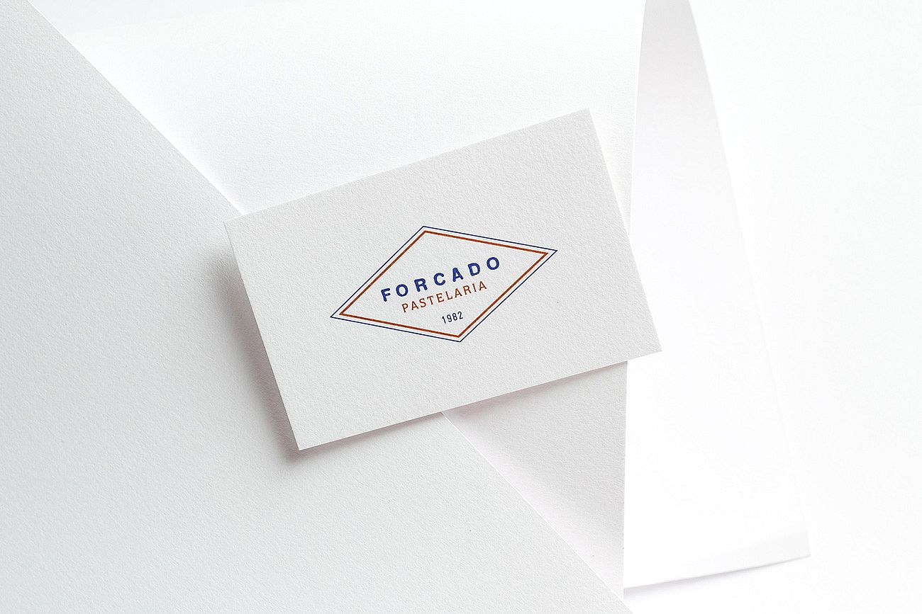
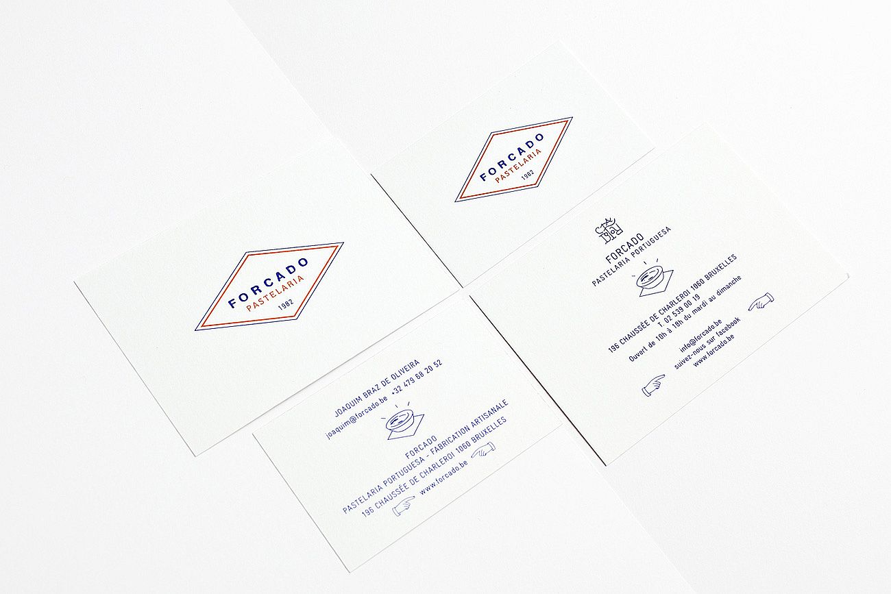
Forcado
Forcado’s visual identity couldn’t be a mere pastry box and a sticker on the storefront. This place needed just the right identity: a recognizable visual code that communicates the values and the history of the concept, as well as the human and familial side of the team, something to make you want to push the door open and come back again.
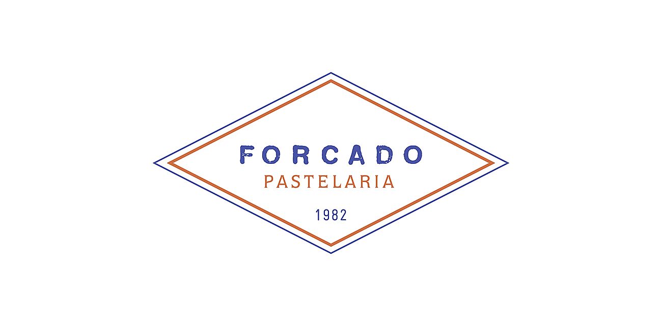
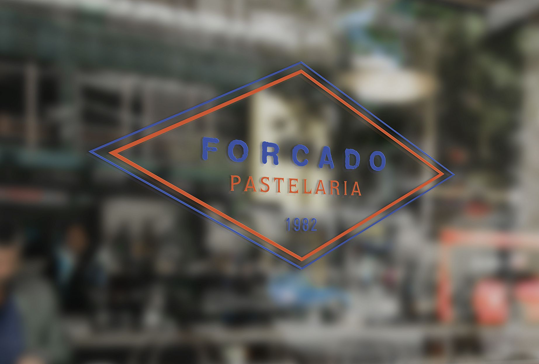
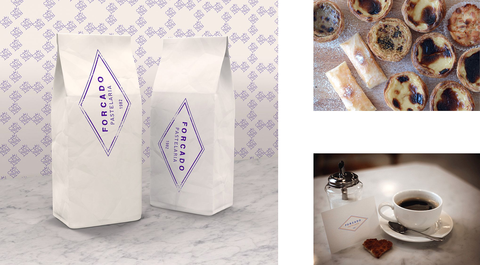
The visual identity we developed for Forcado takes into account the codes of its Portuguese heritage, while at the same time embracing something modern, gourmet and generous.
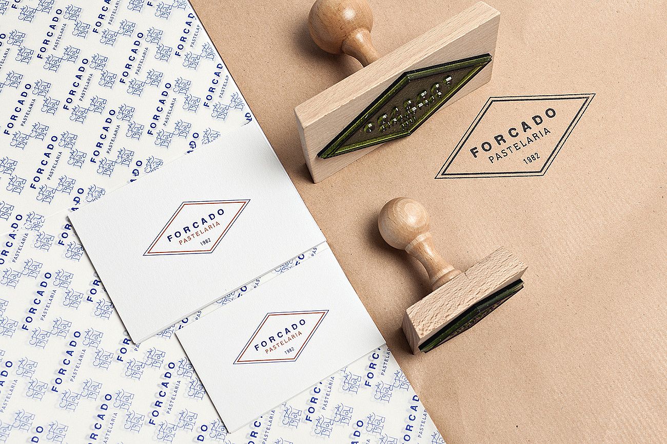
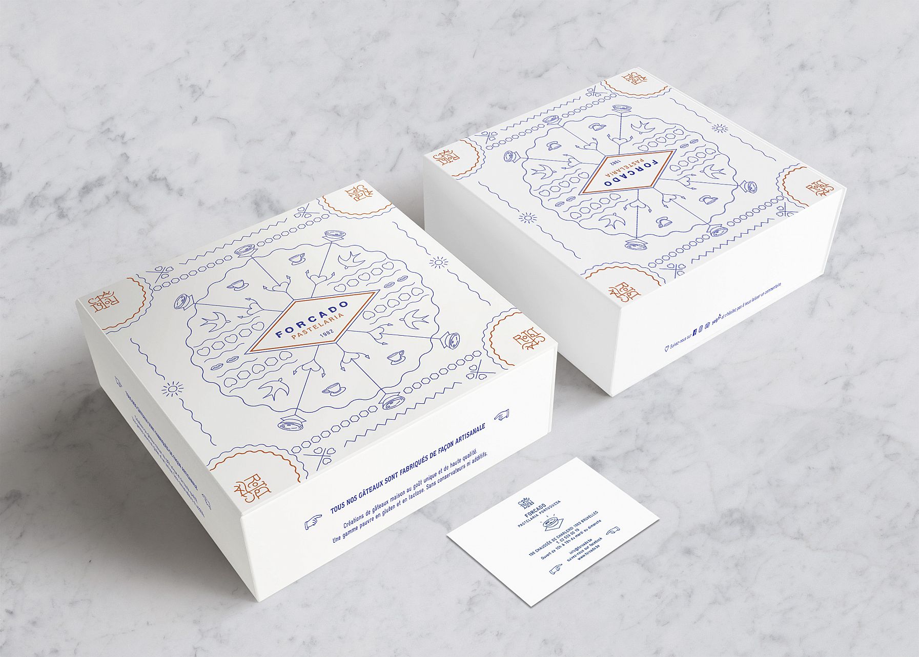
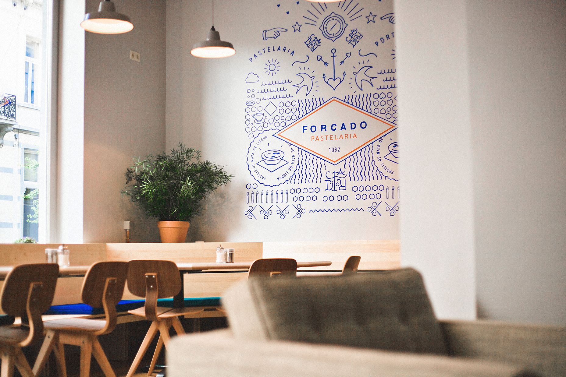
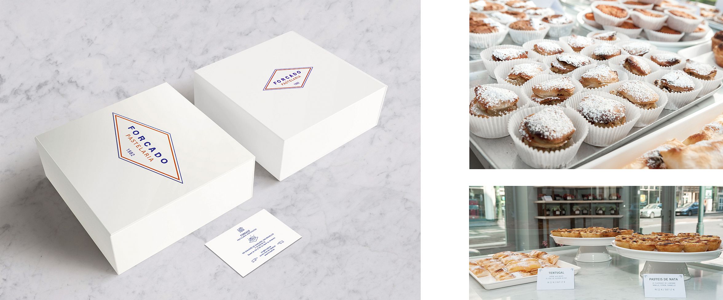
The custom logo font was conceived with the help of stamps to express authenticity, the human touch and to suggest artisanal craftsmanship, pleasure, and savoir-faire… To complete the logo, a monogram, also handmade, was realized by way of signature. This monogram becomes a motif, calling to mind decorative Azulejo, traditional Portuguese painted ceramic tiles.
The range of colors includes royal blue, evoking the Portuguese sky, Azulejo, the ocean… and cinnamon orange suggesting pastries, sugar, the gourmet aspect, and homemade goodness.
The lozenge that frames the name is a nod to the paper napkins on which pastei?s (Portuguese tartlets) are traditionally served. As for the small, flecked decorative markings, they call to mind the powdered cinnamon sprinkled on the pastei?s. The lozenge also suggests flags or old store signs that can still be found in Portugal.
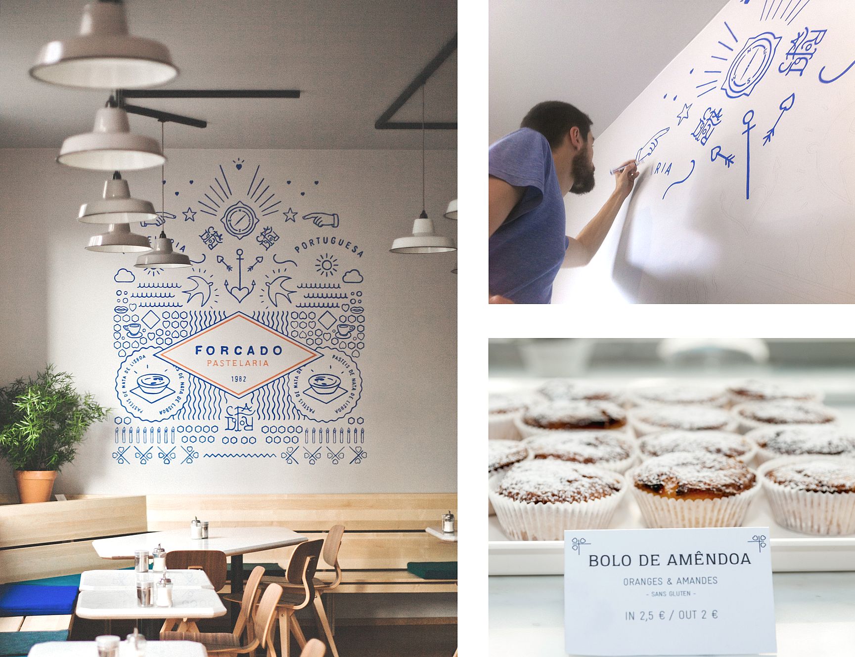
This artisanal and traditional visual identity is complimented by a fresco/composition of forms and drawings referring to travel, Portuguese history, conquistadors, Vasco de Gama… Forcado’s is a special history, evoked by this grand illustration treated in a contemporary graphic manner, that forms a library of exclusive drawings, rendering the location’s communication as unique, authentic and personalized as the location itself.
Stationary pictures by Christophe Coënon
—